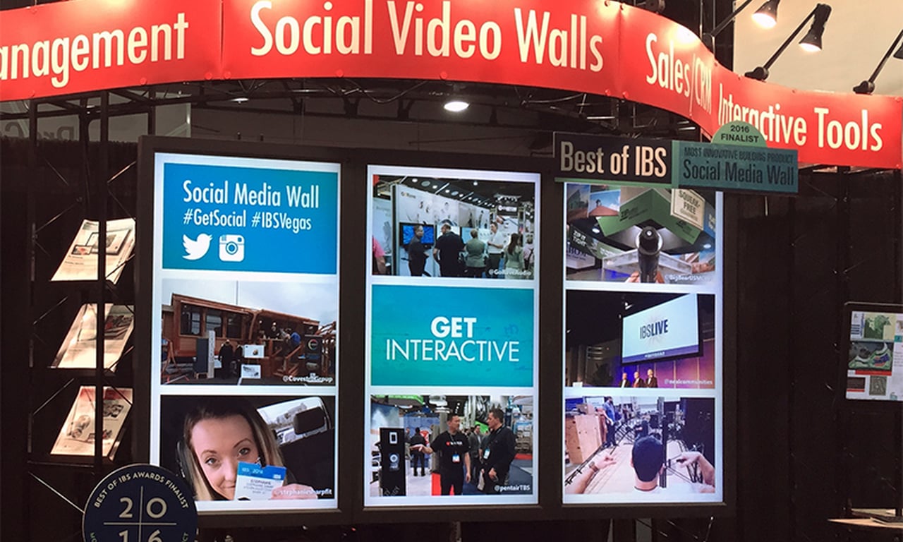
Digital content evolves from multi zones to simple full screen

During the brief arc of digital signage history, something significant happened that is just now having major implications on the way messages are delivered on screens – Yahoo launched (1995) and, not long after that, Google launched (1998).
The two search engine giants spent a few years finding their footing, but now it’s clear which site has come up on top. Google, the No. 2 most valuable brand according to Forbes, has 76 percent of the search ad market. That number is expected to grow to more than 80 percent by 2019, according to eMarketer.
There are a host of reasons we gravitate toward Google for quick searches – algorithms, key words, complementary services and ease of use among them. Google has been winning the search wars without bells and whistles, guiding its users to their destination via a simple search box. That’s it.
Since Google’s launch and subsequent domination, we’ve become accustomed to that simplicity, and content presentation on digital screens has followed suit.
According to Ryan Cahoy, managing director of Rise Vision and a member of the DSF board, digital screens 20 years ago were full of moving boxes, tickers and as much information as you could fit.
“Everyone was making their own Bloomberg TV. How many boxes and zones could you create? It was driven by the technology that started the industry. Everyone was conditioned to that technology and seeing how much data they could put out there because they thought it was how they could get the best investment on something that was new and expensive,” Cahoy said. “Now, we’ve all had a chance to take a step back.”
And while the technology is still a critical piece in a successfully executed digital signage strategy, it’s not driving the industry on its own anymore.
“Now it’s about how you use the technology, present it, create the user experience. As the industry grew and different people with different perspectives came in, we could focus on the bigger picture and we realized we were doing it wrong,” Cahoy said.

Multi-zone screens such as those made common by Bloomberg TV are becoming less common.
Multi-screen presentations, he adds, give users a bad experience. If a client asks how many zones they should have, “the answer should be one zone, one message,” Cahoy said.
If they want more than one message, they should consider getting more than one screen.
Cahoy adds that is not always practical. Universities, for example, tend to approach communication through committees.
“Everyone has a different idea and they tend to compromise with, ‘Well, since we spent this money, let’s put it all out there,” he said.
One alumni foundation his company worked, for example, with wanted a directory, weather, sports, news, events and wayfinding information pushed through its digital screen.

Users tend to take no action from a busy screen because the messaging is too complex, according to Ryan Cahoy.
“We were up to 12 to 15 buttons on the screen. What happens is users have all of these choices and they inevitably do nothing because it’s too complex of a message. And, the donor’s purpose was lost because everyone was thinking about the shiny, new toy instead of coming up with a strategy about their goal or purpose,” Cahoy said.
The only exception to having multiple zones is if the screen is in a common area, such as a food court, where users have the opportunity to digest more content for a longer period of time.
“But even then, in general, a simple message that is well done has far more impact,” Cahoy said.

One simple message in this subway ad.
Does having a single screen affect the longevity of a message? The rule of thumb for Cahoy is allowing enough time to read the message backwards.
“You can have a slide that just says, ‘hello,’ and a slide with 10 bullet points. You’re going to get a much better use of digital signage if each message is timed to its optimal length,” Cahoy said.
For those who still feel the need to put the “kitchen sink” of information out there, he said the solution is to instead provide users with an action item on the digital screen — guide them to a website or a mobile app where more it makes more sense for more information to be located.
“Think of the display as a sign post that is guiding users to their mobile phone because that phone is with everyone everywhere, and if I’m passing a sign quickly, I’m more likely to pull out my phone and keep going than I am to stick around to wait for information on the screen,” Cahoy said.
“We should really think about every mobile device as a digital sign, whether we create it or not, and the display should push users to that device.”


